Award-winning Logo Design for a Unique Lending Company Serving a Niche Industry - Greenlock
Categories: Brand & IdentityGreenlock, Inc. is not your typical business lending company. They don’t provide loans to just any business. Rather, they specialize in providing loans specifically to General Contractors in the insurance restoration industry. These are contractors who complete repairs on residential and commercial properties that have been damaged and are using insurance money to pay for the restoration. The contractors who take on these types of projects often don’t see payments until well after their work is done—creating a cash flow nightmare for their companies. Greenlock steps in with funding to help contractors pay their expenses until the insurance payment comes through.
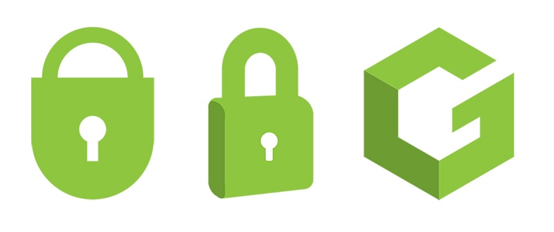
After helping Greenlock through the process of naming their new company, they tasked the Modmacro team with creating a unique and memorable logo that would look great on everything from polo shirts and hats to digital assets. We presented the leadership team at Greenlock with multiple logo options. Their final choice was a two-tone green icon that incorporated a “G” and an “L” in a way that they found to be clever, but subtle. The accompanying text is a clean, modern Sans Serif font.

Like we often do when we design logos for our clients, we made the logo mark and the text separable—meaning the icon can be used independent of the company name. The text can also be used to the side of the icon or underneath, giving the company options for vertical and horizonal applications.
Greenlock has big plans for the future and for the growth of their lending company. One of their owners commented that their new logo will look great on the 20-story building they will own and occupy one day!
The Greenlock, Inc. logo is the winner of a Hermes Creative Award in the Logo Design category.

Awards and recognition from the professional community.

