Logo Refresh for Pest Control Company that Packs a Punch - Knockout Pest Control and Termite
Categories: Brand & Identity
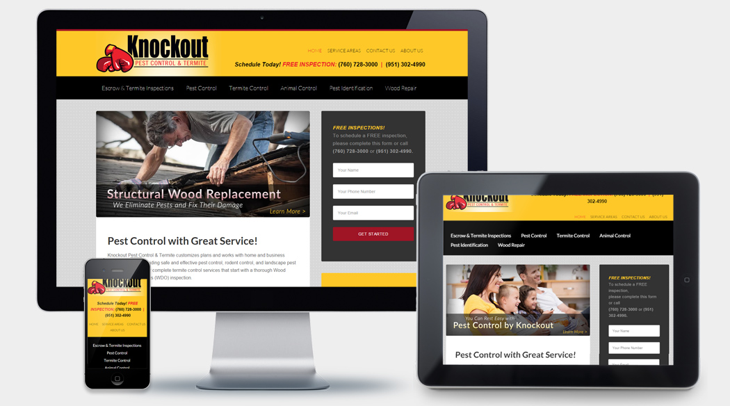
Knockout Pest Control & Termite, a well-established Southern California pest control company with deep ties to the communities they serve, came to Modmacro for a logo redesign. They were looking for something clean and professional, but also a logo that would stand out and grab the attention of potential customers looking for pest control solutions.
With the Knockout Pest Control & Termite logo, we wanted to take a different approach than many pest control companies seem to take. So many pest control company icons feature the bugs or rodents the company is trying to eliminate—ants, spiders, rats, etc. Sometimes, the pests featured in other companies’ logos are even cute, smiling cartoon characters. This seems completely counterintuitive in our opinion. Why would you try to create a sort of affection for the thing your potential customers are trying to trap or exterminate?
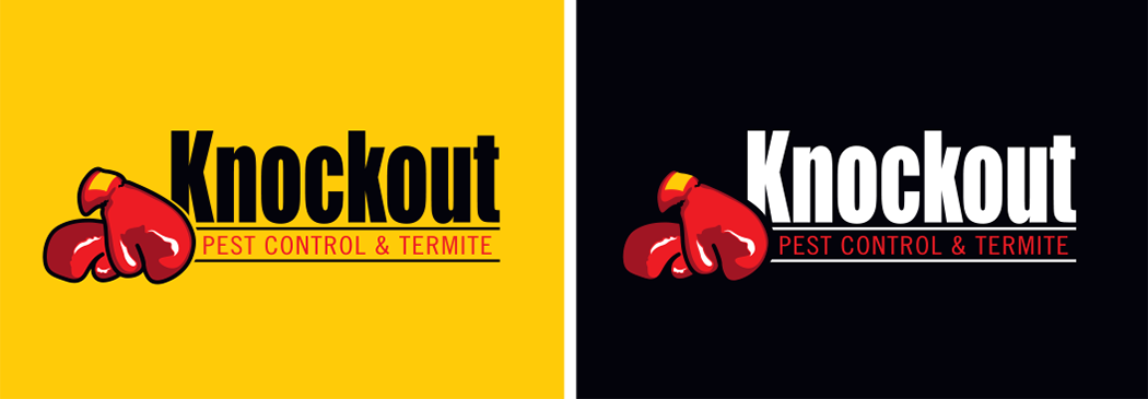
With the icon we designed for Knockout, rather than focusing on the pest, we decided to focus on the solution that the company provides. We played off of the name Knockout and designed a pair of boxing gloves, which give a nod to the company’s goal of completely “knocking out” their customers’ pest problems.
By using boxing gloves as the icon, it also doesn’t lock the company into treating one type of pest, like it could if they used an ant or a mouse as their icon. This is especially important because Knockout handles pest problems as varied as ants, spiders, rodents, birds, and termites. In addition, they offer wood repair services for any structures damaged by wood destroying organisms.
The red we chose for the boxing gloves is a vibrant shade that really stands out on company vehicles and other forms of advertising, such as company shirts, billboards, and more. For the company name, we chose a bold sans serif font for the word “Knockout”, and used a slimmer font underneath for “Pest Control & Termite.” Both fonts are clear and easy to read. The logo as a whole looks great on both light and dark backgrounds, giving the company lots of options in the design of future promotional materials.
Overall, Knockout’s new logo is striking and memorable. In a competitive industry like pest control—with several big players that are already household names—it’s was vital for Knockout’s new logo to stand out and capture the attention of potential customers.
We think our design team knocked this one out of the park!

